If you missed any previous parts of this story, you can access them here: Part Une, Part Deux and Part Trois.
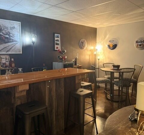
Once the bar wall was finished and the furniture put back in place, the basement rec room refresh already made it feel like a different room.
That one wall provided the darker, moodier look I wanted, but a few carefully chosen additions helped carry that feeling throughout the space. I did not replace the furniture or buy an entire room full of new décor. Most of what you see was already here.
I simply added a few pieces that supported the new direction.
The Rug That Softened the Room
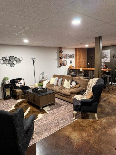
The new area rug was the largest purchase for this refresh.
I wanted something lighter than the dark feature wall and furniture but still muted enough to work with the warm flooring, faux-cowhide rug and industrial elements already in the room. Its faded, vintage-inspired pattern softened the space without making it feel too formal.
The rug does change noticeably depending on the lighting. Beneath the overhead can lights, some of its warmer tones become more visible. With only the lamps turned on, the colors look softer and more subdued.
It was a good reminder of how much lighting can affect the way a rug—and an entire room—looks.
The rug was on sale, and an additional Amazon coupon saved us $39.00.

- Durable and Non-Shedding: Quality craftsmanship and materials maintain Valhir Collection rug texture, color, and overall…
- Non-Slip Low Pile Rugs:This area rug made of high-quality low pile fiber, featuring a soft density surface, Ultra soft t…
- Easy to Maintain:HUGEAR machine washable area rug 8×10 is made of spill and stain-resistant fiber, Use vacuum cleaner an…
Cast-Iron Candle Holders
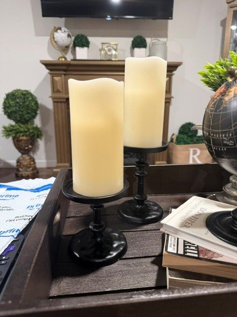
This set of cast-iron candle holders was one of those purchases that immediately felt right for the room. Their weight, texture and black finish complement all the industrial details. They provide height and presence without feeling overly decorative, and they look especially good alongside the room’s railroad pieces.
At $41, they cost a little more than I would normally spend on candle holders. But since I saved $39 on the rug, it still counts as a win.

- CAST IRON PILLAR CANDLE HOLDER SET: Crafted from solid cast iron with a handcrafted antique finish, these decorative bla…
- DESIGNED FOR STANDARD PILLAR CANDLES: Each classic candle stand features a 3.5″ inner tray diameter and 3.9″ outer diame…
- DECORATIVE HEIGHT VARIATION FOR VISUAL INTEREST: Includes one large candle holder measuring 3.7″ x 5.8″ and one small ca…
A Vintage Train Print
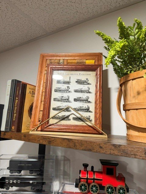
This small vintage train print was an inexpensive way to reinforce the room’s railroad theme without overwhelming the shelf.
I already owned the frame, so the only thing needed was the 8-by-10 print. Its size worked perfectly layered with the wine cork artwork and other pieces already displayed there.
The railroad references are a part of the theme we came up with when this room was first finished. You see, Jeff’s longtime nickname is “Coach Rale”—a play on our last name, Raley. Several of the train pieces belonged to my father, including the Lionel train set from the 1940s.
The new print simply adds another layer to the story that was already present in the room. I also like its aged, vintage appearance.

- ✅UNFRAMED PRINTS: We create all our prints in variation of standard sizes from 8×10 to 24×32 inches. For your convenienc…
- ✅QUALITY MATERIAL: Our wall art prints are printed in the USA on fine art matte paper. Our posters can last forever with…
- ✅AESTHETIC DECORATION: Poster wall decor is a popular and elegant way to decorate a room nowadays, it is a good choice t…
Making It All Come Together
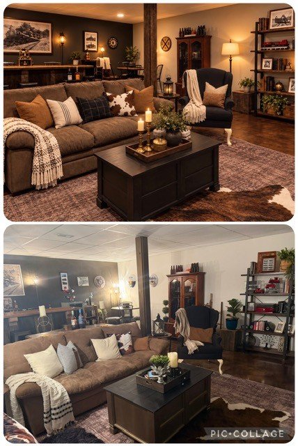
Aside from those purchases I mainly restyled pieces already owned. The coffee-table tray received a fresh coat of paint. The globe, books, lanterns, and most of the shelf décor were already in this space or elsewhere in the home. Some of the pillows were simply flipped over to display their neutral side rather than multiple patterns. Rearranging accessories and removing what no longer fit suited the direction of the room.
Including the rug, candle holders, and train print, I spent less than $200.
This room is a good example of how one strong color choice, a new arrangement and a handful of well-chosen pieces can completely change a space without replacing everything in it.
It is also the idea behind Sophie Sees, my virtual room re-imaging service: Sophie provided the vision, and we made it a reality using much of what was already owned. Looking at this inspiration picture and reality—the room didn’t land too far off at all!
But Am I Really Finished With The Basement Rec Room Refresh?
But just when I thought the basement rec room refresh was complete, another question began creeping into my thoughts:
Should the remaining walls be painted a darker color?
The custom blackened-bronze wall behind the bar completely changed the feeling of the room. What once felt a little plain and cold now feels warmer, moodier and much more intentional.
But as often happens with decorating, one successful change made me look at everything else a little differently.
The Walls That Were Left Behind
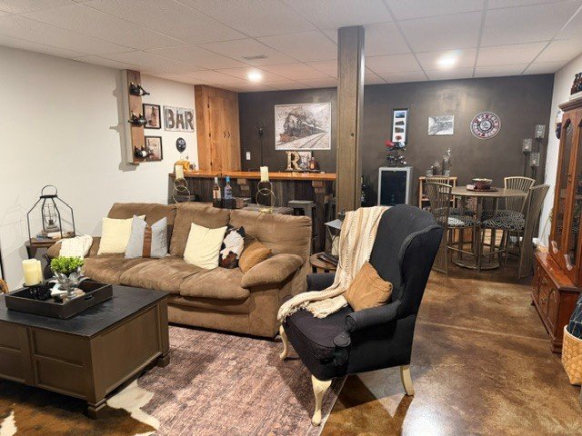
Most of the basement walls are still their original light Wispy White color.
Before the refresh, the lighter color helped keep the room with virtually no natural light from feeling too dark. Now, beside the rich blackened-bronze feature wall, some of those pale walls look a little stark and less connected to the room’s new direction. They are not necessarily wrong. They simply belong more to the room we started with than the room it has become.
I briefly considered warmer neutrals, including Sherwin-Williams Accessible Beige, Shiitake, and Loggia. I also considered white-washed brick wallpaper that could complement the industrial elements in the space.
All were reasonable possibilities. But, none gave off quite the effect I was looking for.
Three Dark Colors Still In The Running
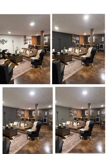
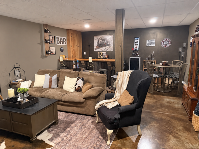
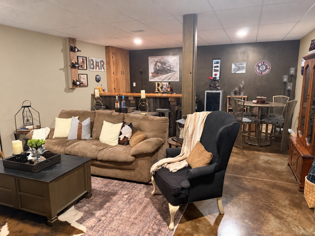
The color I keep returning to is Sherwin-Williams Iron Ore. It is a deep charcoal with a softer appearance than black, and would complement the blackened-bronze wall beautifully while allowing that custom finish to remain the star of the room.
But, with an eight-foot drop ceiling and no natural light, painting every wall full-strength Iron Ore could make the room feel more enclosed than cozy.
That leads to three possibilities:
- Iron Ore
- Peppercorn, which is slightly lighter than Iron Ore
- Grizzle Gray, the lightest of the three
Rather than paint every light wall, I could use one of these colors only on the side walls. That would deepen the room, reinforce its subtle speakeasy vibe and create a stronger connection between the fireplace, dark furnishings and bar wall—without turning the entire basement into a dark box.
Leaving the Television Wall Light
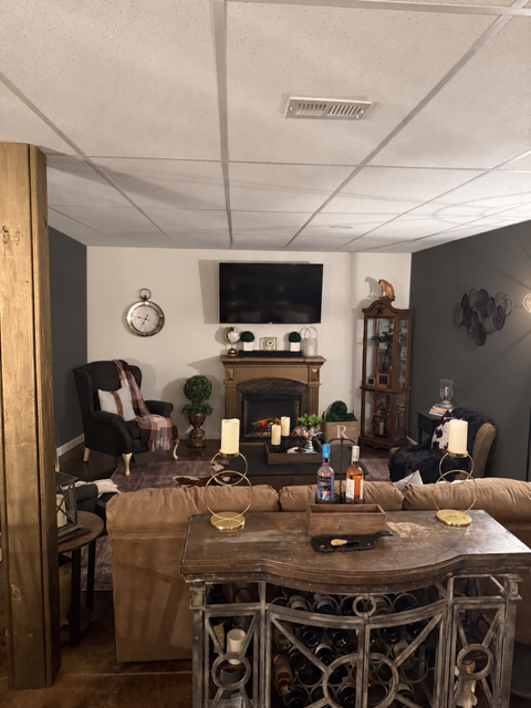
The television and fireplace wall presents a different challenge because there is no obvious place to stop the paint. It continues through the stair landing and connects with another room, so changing its color would be make a cutoff point quite complicated.
Leaving the wall light may actually be the best design decision. Against darker side walls, the pale television wall would look intentional—almost mimicking a large movie screen at the end of the room. It would also reflect more light and give the eye a place to rest.
Sometimes contrast does more for a room than painting every surface the same color.
One Room, Two Good Options
At this point, there are two possible directions:
- Leave the remaining walls light and allow the blackened-bronze bar wall to remain the room’s single dramatic feature.
- Paint the side walls Iron Ore, Peppercorn or Grizzle Gray while keeping the television wall white.
The first option is brighter and requires no additional work. The second would create a moodier, more enveloping room while preserving enough contrast to keep the basement from feeling heavy.
Jeff has not signed off on more painting yet—and considering that he did all the painting the first time, his vote carries a little extra weight.
What Would You Do?
Would you leave the room as it is, with one dark feature wall?
Or would you carry the mood further with Iron Ore, Peppercorn, or Grizzle Gray or a totally different color on the side walls while leaving the television wall light?
Tell me which direction you would choose. You can help my indecisive self determine what happens next.
Because apparently, a room refresh is never truly finished when my brain starts rethinking about another gallon of paint.
Leave a Reply